What We Do
Our Work
Top Voices 2026
Contact Us
Latest Insights
Global
Residential
Property Marketing Predictions 2026
Explore what theEword’s residential team predicts for property marketing in the year ahead.
UK
Residential
The Downsizers Report
Uncover the motivations, preferences, and behaviours driving Baby Boomer property purchases in the UK.
What we do
Our Work
Top Voices 2025
Careers
BLOG
Contact us
What We Do
Our Work
Contact Us
Latest Insights
Global
Residential
Property Marketing Predictions 2026
Explore what theEword’s residential team predicts for property marketing in the year ahead.
UK
Residential
The Downsizers Report
Uncover the motivations, preferences, and behaviours driving Baby Boomer property purchases in the UK.
What we do
Our Work
Careers
Contact us
what we're
THINKING
.
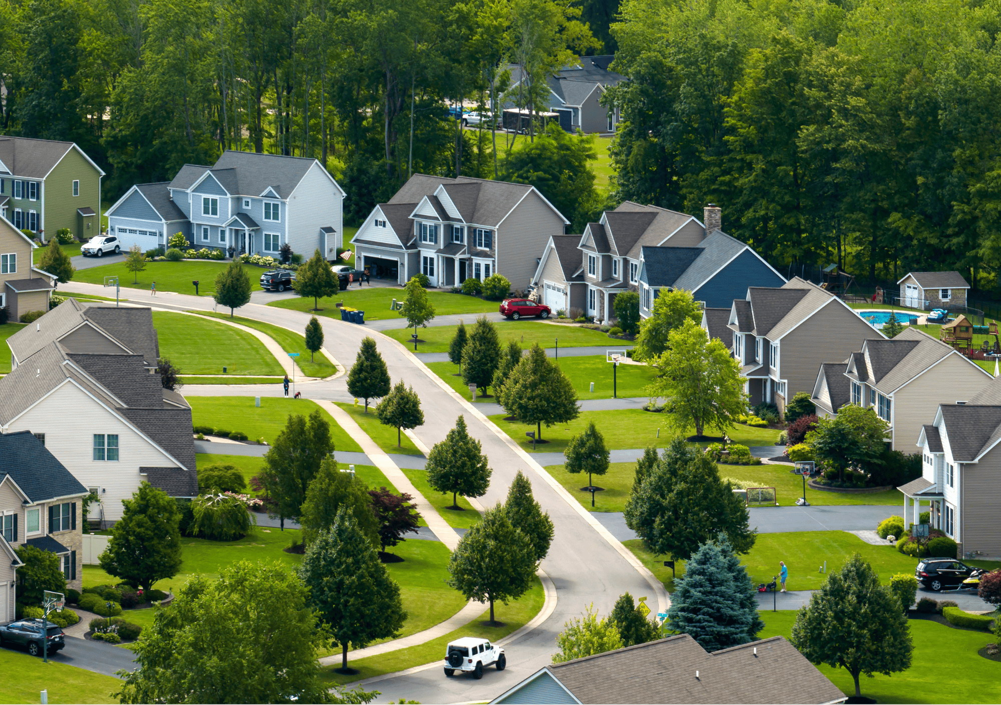
Residential Property Marketing
Featured THOUGHTS
The New Build HomeBuyers in 2026
1,000 UK homebuyers told us how they search, what they trust, and how they decide. Here's what the data tells us about reaching new build buyers in 2026.
Read Post
Property Marketing
Later Living’s Potential, Powered by Digital Marketing
Only 1% of older people live in purpose-built Later Living schemes. Learn why awareness is so low, how buyers research options online, and where digital marketing creates real impact.
Read Post
Property Marketing
Your Peak Season Marketing Checklist
Get your property marketing ready for January’s peak season. Read our checklist and learn the digital tactics to make your campaigns perform at their best.
Read Post
Residential Property Marketing
Baby Boomers Are Buying Property
Baby Boomers have overtaken millennials as the UK’s biggest property buyers in 2024. Discover what’s driving this shift and why older buyers are surprising the market.
Read Post
Property Marketing
Why Outstanding Client Service is so Important
From student accommodation to residential properties and marketing agencies, discover why exceptional service fosters trust, drives conversions, and ensures long-term success.
Read Post
Featured Article
What Do Students Want?
Explore the PBSA booking journey across the marketing funnel with insights to attract, convert, and retain student accommodation residents.
Read Post
Student Accommodation Marketing
Digital Marketing Strategy & Execution
Discover theEword’s incredible journey through 2024! From standout campaigns and six new client wins to team growth and celebrations, explore how we pushed boundaries in property marketing and set new standards for success.
Read Post
theEword Wrapped 2024
Residential Property Marketing
Stay ahead in the Midlands property market with actionable insights from audience analytics
Read Post
Decoding The Midlands Property Market: Key Insights for Property Marketers
Residential Property Marketing
Discover how property marketing has evolved and what you need to know for 2025
Read Post
Property Marketing Has Changed: Here’s Everything You Need to Know
Student Accommodation Marketing
Discover the driving factors behind Spanish students' PBSA preferences and how to market to them
Read Post
Your Guide to Marketing to Spanish Students
Property Marketing
New property marketing insight series from theEword
Read Post
theEword launches new insight offering
Student Accommodation Marketing
An overview of our highly successful CallRail implementation for Yugo UK
Read Post
Listening to the student voice with CallRail
Student Accommodation Marketing
An overview of our PBSA research that focuses on student preferences, digital behaviour and accommodation experiences.
Read Post
What Do Students Want?
Property Marketing
The five key elements of a successful property marketing campaign in 2024
Read Post
Property Marketing 2024: Five things to get right
Property Marketing
How to lower the cost per lead of your property marketing by deploying a smarter digital acquisition strategy
Read Post
Lower your Cost Per Lead with Smarter Property Marketing
Digital Marketing Strategy & Execution
How can chatbots help property companies reduce their cost per acquisition
Read Post
Why chatbots are the future of property marketing
Student Accommodation Marketing
Read an overview of our research that covered hundreds of students related to their TikTok and YouTube usage
Read Post
TikTok vs YouTube: our top five takeaways
Property Marketing
How to create a digital marketing strategy for brand new property developments
Read Post
Property marketing: advice for new developments
Property Marketing
Read about the new technology that we've built to support property companies
Read Post
Why we’ve built another startup (and why it’s PropTech)
Property Marketing
The key elements of a high-performing virtual viewing page
Read Post
Create a great virtual viewing landing page: top tips


.png)
.png)
.png)
.png)
.png)
.png)

.png)
.png)
.png)
.png)


