

Any good CRO (converstion rate optimisation) campaign starts with a detailed research stage to find out what could be improved on your site. As it isn’t always possible to go into this much depth, we sometimes have to take a more instinctive approach.
So, here are our top five recommendations for things to take a look at on your site, should you want to do a quick and dirty test.
Carousels
A favourite of many a client, carousels are often used due to being able to fit large amounts of information into a small space. Sadly, user testing often finds that your visitors end up getting distracted with the constant animations and conversion rates actually suffer as a result.
If all of this doesn’t persuade you then maybe Nielsen Norman Group, the kings of usability studies, will. They found that users in the majority of cases completely ignore carousels at best and found them annoying at worst.
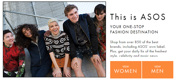
If you really can’t decide on one banner to replace a carousel, try creating a static banner with links to separate areas of your site instead. ASOS do this well, with separate links to women’s and men’s clothing. So many ecommerce retailers still get this wrong and overload visitors with five or six different banners, none of which will be getting clicked.
Videos
Instead of using images or large amounts of text, try using videos instead. If your product or service is complicated and difficult to explain, then videos can be perfect for showing potential customers what you’re all about.
Usability studies have also found that visitors are more likely to watch a short video than read large amounts of text, although this depends heavily on your site and the industry. There’s no guarantee that video will work, which is why it’s so important to test first.
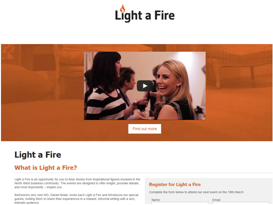
We found that video works extremely well on landing pages designed to promote our ‘Light a Fire’ event. When considering whether to attend, we found that a large amount of people want to see exactly what happens at one of these events. It’s also a good opportunity to give testimonials from previous attendees and really persuade people to sign up.
Reviews/Testimonials & Trust Symbols
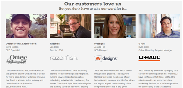
Fear is a major barrier to any purchase. People are wary of handing over their personal information to a company they’ve never heard of before. Reviews & Testimonials are a great way to instil trust in your brand.
However, there’s a right way and a wrong way to do them. The most important thing is to make sure they’re believable; gushing praise for your company will just make the reader think you’ve written them yourself.
Pictures or videos of the reviewer help to increase credibility even further, especially if they’re well known in the industry you operate in. Celebrity endorsements are used for a reason, because they work.
Trust symbols are similar in that they increase willingness to hand over personal information in the checkout stages. The Baymard Institute performed a large amount of research and found out that ‘Norton Secured’ & ‘McAfee Secure’ badges generally worked the best for instilling trust in a checkout process.
Forms
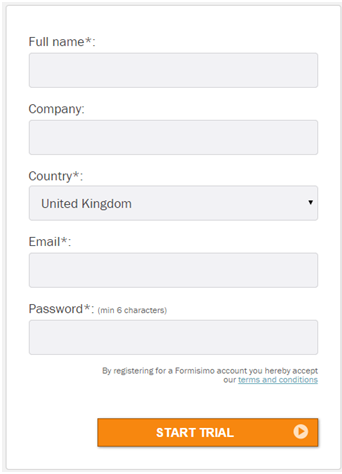
This is the final stage for potential customers. One mistake here and you lose a customer forever. It’s perhaps the most important stage to get right, yet many companies spend almost no time considering the usability of their forms. Various tools such as Formisimo are available, which can track what your visitors are doing on your forms. Seeing where people get stuck and drop off is invaluable for optimising your forms.
[contentform subject=”Contact Us” ]
For example, you may find that asking users for a fax number or even a home phone number is causing large amounts of people to drop off. Not everyone wants to give out four or five methods of contacting them. Often simply asking for a single phone number or email address will suffice and will lead to much more people filling the form in.
Long vs. Short Copy
There’s no bigger myth than the idea that people don’t read lots of information online. However, the debate between long and short copy has raged on for as long as many of us can remember.
Unfortunately, there’s no one best practice. Many companies finding longer copy helps whilst others find shorter works to their advantage.
In theory, expensive or complicated and difficult to understand products/services require longer amounts of copy to fully explain key selling points. Simple products/services generally require much less. Don’t just blindly follow this though, remember to A/B test as you never know if this will help or hinder you until you’ve proved it definitively.
Want more?
Download our free 26-page guide to CRO by clicking the button below:
{{cta(‘43122ef6-6820-48d8-8fb8-f4601a21ac48’)}}